The Year of Gephi🎄✨
Happy Holidays. Influence Networks. and the Inner workings of a Toronto Star special investigation.
I’m starting to write this next to a fireplace on Christmas eve; the snow falls gently outside, beckoning a Canadian winter. There’s plenty to be grateful for in 2021, home, school, family. Among these, I’m truly grateful for this journey writing Brackets.
Exactly a year ago, I decided to start Brackets. As much as I was writing this blog to share cool tools in tech and journalism with you, I was admittedly also writing Brackets for myself. Every Brackets post was akin to a digital diary documenting my journey into the crazy world of open-source investigative journalism, which begun as a wide-eyed student meeting a NYT-Bellingcat “movie-star”, and ended with working alongside some of my open-source heroes at the BBC Africa Eye (and a full-time job offer I seriously considered dropping out of school for).
In this new years edition of Brackets, I want to share the favorite tool I’ve used this past year. Gephi. I’ll reflect on the best resources and useful tricks I’ve picked up while learning Gephi, so that you can learn to use it too!
Lastly, I want to contribute to the community, through sharing some new ideas and ways to apply Gephi in Open-Source work, specifically for investigations with a temporal element. Next week, I’ll also provide a detailed case study through an investigation with the Toronto Star.
Grateful for your support, and wishing you a Happy New Year!
— Edward
With that hyped up intro, you might very well be asking
What is Gephi?
That’s exactly the question, I posed to open-source investigator Ben Strick a year ago.
Google’s answer. “Gephi is an open-source software for network visualization and analysis.” Also used in the academic world, there are several good tutorials for installing Gephi including including this U of T guide, and this ethnographic Medium blog.
But I was asking Ben Strick because Ben is something of the definitive researcher when it comes to using graph visualizations to uncover influence operations around the world. Most recently, Ben was featured on the Financial Times for his work on Myanmar. But his open-source credentials extend far earlier, from working on the iconic visual investigation, Anatomy of Killing, alongside French investigator Aliaume Leroy, featured previously on Brackets, to identifying a Pro-Indonesian propaganda bot network with Bellingcat.
Bots, Bolivia, and Ben’s Blog
In summer 2020, while an intern at Bellingcat, I was working on an investigation of WHO director-general attacked on Twitter with CCP related memes. We were looking at inauthentic online activity (potentially bots). There were network visualizations involved; ignorant and unaware of Gephi’s existence, I painstakingly coded the graphs in D3 Javascript.
Then, I found enlightened. At the start of the year, I stumbled across Ben’s blog and read what I now consider the definitive guide to applying Gephi to OSINT, a case study uncovering a Bolivian influence network.
Among the open-source community, Ben is a total gem, with a million-dollar-smile, and a passion for sharing his knowledge. If you find any part of Brackets interesting, please read Ben’s blog! specifically,
🎄 How I Scrape and Analyse Twitter Networks: A Case Study
Here are my key takeaways:
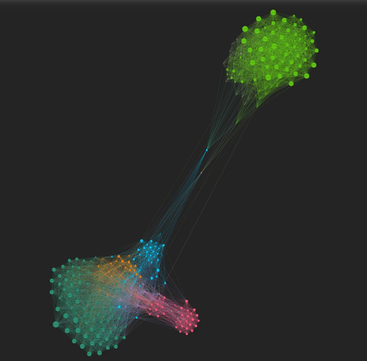
* Research, and past case studies, have shown that clustering into like-minded communities occurs when retweets or mentions are visualized as a network. Thus, we want to visualize influence networks and study the interesting clusters that emerge.1
* Influence networks and their connections can be represented as graphs through edges and nodes. On Twitter, connections can be retweets, which we can collect. Then the nodes of a graph would be a list of accounts. Edges of a graph would be every instance where account A retweets Account B.
* Before importing the data, we need to prepare the CSV sheet containing all edges, and a CSV sheet containing all nodes. For this task, Ben uses the website Table to Net to convert CSV files containing retweets, into CSV files with the edges, and with the nodes.
* Gephi does most of the work in generating the graph. We just import the CSV sheet containing all edges and the CSV sheet containing all nodes into the Gephi Data Laboratory. The end result should be a single big cluster of nodes. Then we run Gephi’s spacing algorithm, and let the algorithm do the work in making a really cool graph!
The Year of Gephi
2021 has been a crazy year for Gephi and network visualizations. More than ever, the pandemic has come hand in hand with the spread of misinformation on social media. Influence operations have continued to run around the world. And we also can’t forget the large amounts of online hate, and extremist group activities, online prior and post January 6th. As a kudos to all the researchers putting taking their digital skills to task, let’s share some Gephi highlights in this crazy year of Gephi.
We’re starting the year strong, with a copy-pasta campaign in India
 A copypasta campaign in India is targeting politically-sensitive tags #TMCHataoBanglaBachao & #KrishokSurokhaAbhijan on Twitter. I captured data over the past week for analysis. Report: benjaminstrick.com/twitter-analys… CC @TwitterSafety Here's some findings in this #OSINT thread 🧵👇
First Draft does some great work on Youtube, revealing a vaccine misinformation network: https://firstdraftnews.org/long-form-article/misinformation-youtube-recommended-videos/
In the middle of the year, Oxford Internet Observatory, and researcher Marcel Schliebs released evidence of a pro-China info-op, with overlap and twelve accounts that were previously named in Graphika’s spamouflage breakout.
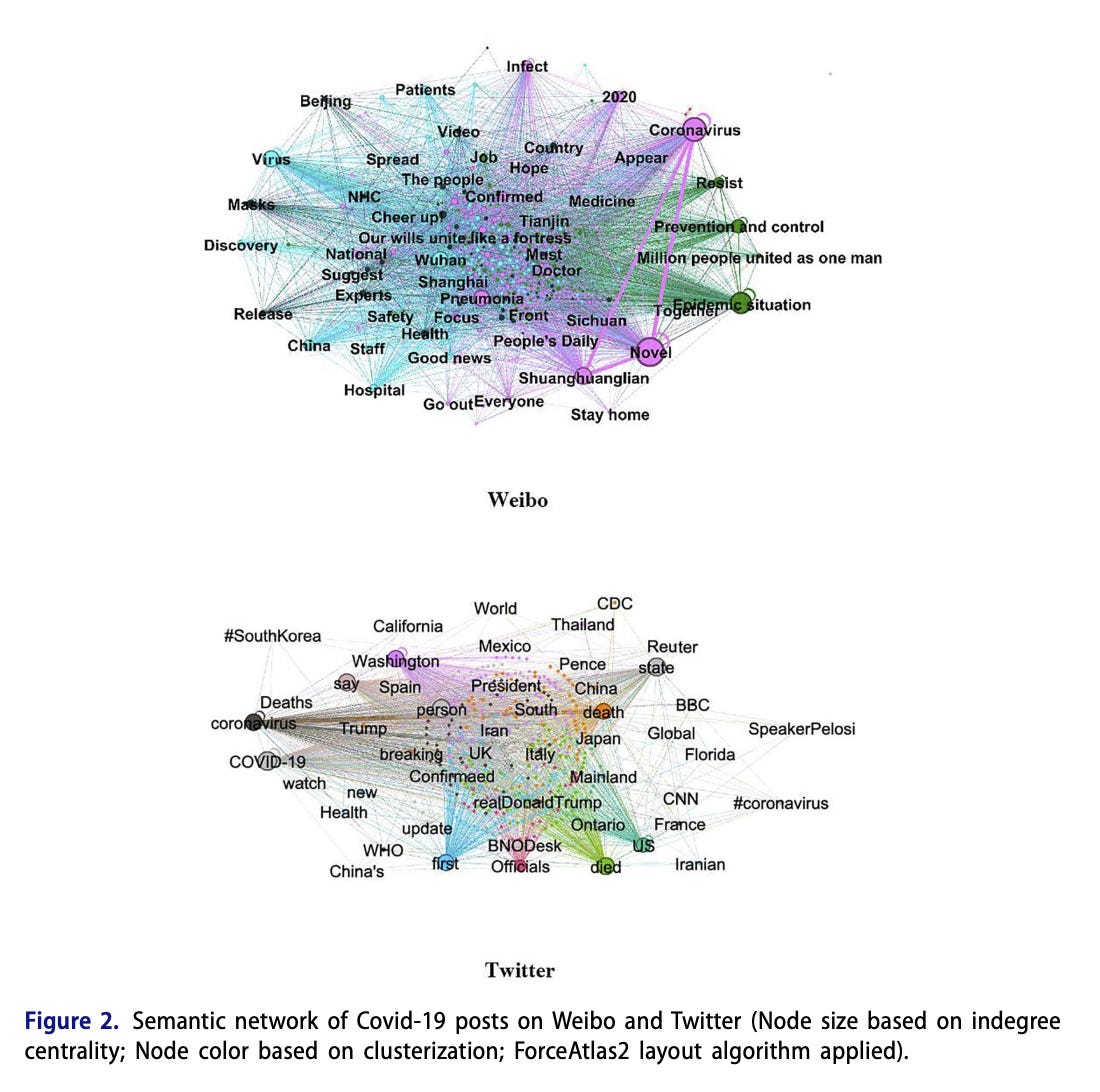
I found this study by Yang and Vicari, on the differences between information spread on Weibo and Twitter, at the Outbreak of the Covid-19 Epidemic in China and the West, absolutely mind-blowing fascinating. 🤯https://www.tandfonline.com/doi/pdf/10.1080/10646175.2021.1945510
Here in Canada, the Toronto Star looked into the spread anti-vaccine sentiment and online hate with the #nomorelockdown movement. I was part of this investigation; and will share a step by step guide and case study, in the next edition of Brackets!
On Arabic Twitter, Al-Shargabi and Afef Selmi produced a comprehensive overview on social analysis and visualizations of Arabic Tweets During the Covid-19 Pandemic: https://ieeexplore.ieee.org/stamp/stamp.jsp?arnumber=9462137
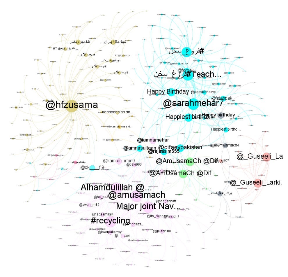
Last but certainly not least, Logically.ai recently released a Pakistan-Based Disinformation Op Focuses on Mizoram-Assam Border
https://www.logically.ai/articles/pakistan-based-disinformation-op-focuses-on-mizoram-assam-border
Thanks for reading! And the very best wishes to you into the new year.
Willis, Alistair; Fisher, Ali and Lvov, Ilia (2015). Mapping networks of influence: tracking Twitter conversations through time and space. Participations: Journal of Audience & Reception Studies, 12(1) pp. 494–530.


