The non-definitive guide on Data Visualization in Investigative Journalism
More than just a pretty graph ...
Hi, Edward here, back for another edition of Brackets!
Recently some folks at the Carnegie Endowment for International Peace asked me to write a chapter on data visualization for their new open source investigations guidebook.
“What credentials to I have to author this?” I thought. “Probably none at all”. But after some searching on the internet, I realized there’s simply not a lot of literature in this space. There’s plenty of amazing articles on building beautiful charts for data journalism, but scarcely anything on applying effective charts in investigations.
As a caveat, any guide I write on data visualization is far from definitive, and only draws upon some personal work experience. However, I have noticed that all the graphs in investigations I’ve worked on this past year follow a common theme. They all fall under three main categories, three key charts types that I hope will be an asset for more investigators — Hotspots, Patterns, and Connections,
Data visualization experts have innovated extensively on alternative story formats, on the interactive charts, 3D renderings of world events, and scroll-through stories (aptly named scrolly-telling), that have revolutionized our digital news diet. These visuals are as complex as they are beautiful, some taking months to build in extensive Javascript code.
They are also, however, often too involved for open-source intelligence (OSINT), where visuals are characterized by quick turnarounds and simple, to-the-point graphs. Simplicity is critical because in addition to conveying information, investigative graphs are used to help uncover leads. Not only must OSINT visuals showcase an investigation, they must further it and contribute new findings.
1) Hotspots
Investigators often look for “hotspots,” or extremities and outliers in a dataset, as indicators of places worth investigating further. For example, when monitoring extremist groups or conspiracy theorists online, outliers like the small percentage of individuals that take real world action are the most dangerous and important to watch.
The classic example of a hotspot visualization is the heatmap, with which investigators draw attention to the “hot” areas in a dataset by highlighting magnitudes of a phenomenon with color.
Figure 1: Example of a basic 2-dimensional heat map that can be made with the Python Seaborn Visualization Library.
Figure 2: Example of a more complex geographical hotspot visualization that displays locations with high desert locust presence in red. The dataset and map are from the United Nations Food and Agriculture Organization, and was used in a Bellingcat investigation on tracking desert locust swarms.
By highlighting the extremities of a dataset, hotspot visualizations generate leads for researchers to investigate further. Like any great OSINT visualization, it has value during the investigation in addition to displaying the results afterwards.
2) Patterns
Patterns are characteristics of an individual or organization that repeat periodically. They are important because repetition over time is one of the most reliable ways of drawing conclusions about the future, whether those conclusions are about individual behavior or other phenomena.
Pattern visualizations often introduce time as a variable. For example, in working with data on the QAnon conspiracy community, we could plot the times of “Q drops” (posts from “Q,” an internet user who claims to be releasing secret information to QAnon followers) over a 24-hour interval, while ignoring dates.
Figure 3: Visualized times of posting in UTC of all Q drops in October and November 2016. The graph is made with the Plot.ly library in Python.
The resulting bar chart shows the hours where “Q” is most active online and provides insights into the timezone in which “Q” operates through identifying a stretch of time where Q rarely posts, and is likely asleep. Such intelligence built up over time could help identify what actor or actors are behind Q.
Using the Foller.me tool, we can automatically generate these types of visualizations for Twitter data! We can even use the resulting visualization of an account’s tweeting times as a litmus test for bot-like tweeting behavior, where accounts that tweet nearly non-stop over 24 hour periods are likely inauthentic accounts, based on the fact that humans tend to sleep.
Figure 4: During an investigation into a network of accounts spamming Dr. Tedros, the director-general of the World Health Organization, several accounts were identified as inauthentic based on their tweeting times, including @babbabang featured above.
Figure 5: Visualized tweeting times for @DrTedros, a human account with a reasonable seven hours available for sleep between 22:00 UTC to 05:00 UTC.
Pattern visualizations work well in social media investigations, because identifying repeat behavior helps filter out the high amounts of noise in social media data.
3) Connections and Relationships
OSINT investigators are constantly looking for connections between actors that can be visualized as a network.
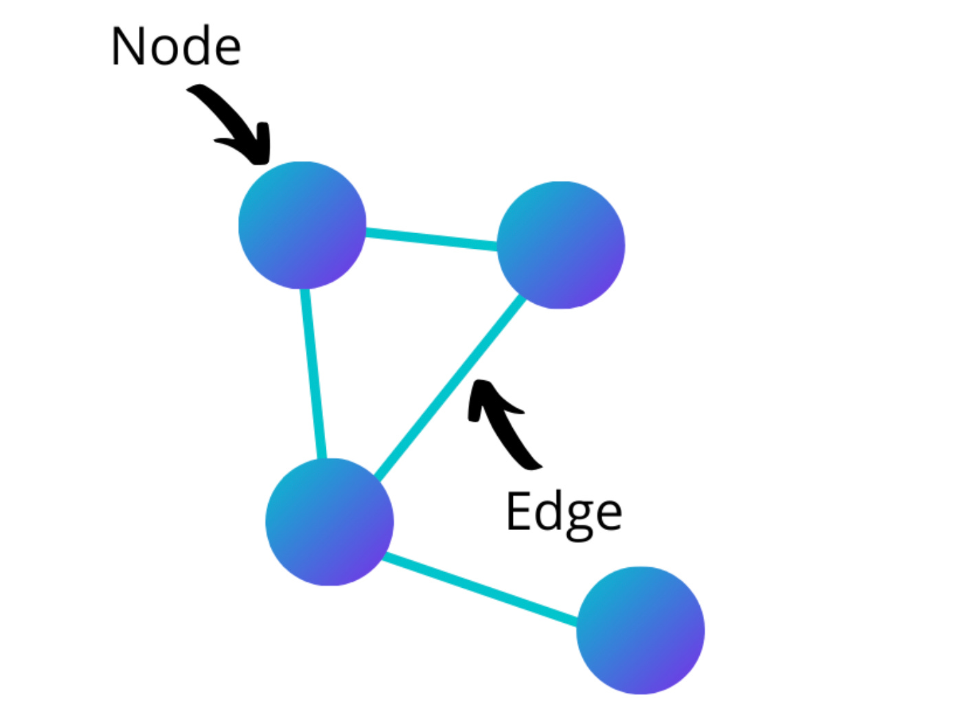
Network visualizations are depictions of a community’s relationships through “nodes”, which represent individual actors, and “edges” which represent their connections. For example, in Twitter networks, the nodes are often twitter accounts, and edges often represent retweets.
Figure 6: Screenshot of nodes and edges in a graph from Towards Data Science
The Gephi software is the gold standard of tools for building network graphs, which a later section of this handbook will explain in depth. Lucid chart is another powerful tool for drafting simpler graphs, quickly and collaboratively online.
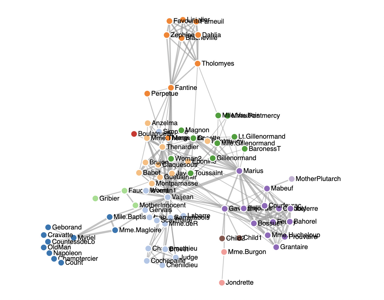
For more complex visualizations, or networks that can move and grow with time, these graphs can be custom coded through D3 javascript code. The D3 Network Graph Gallery is a good place to start with the reference code for multiple graphs.
Figure 7: Network visualization of the famous Les Miserables dataset. Source from Heybignick’s D3 Force Directed Diagram Code.
The association matrix, a visualization popularized in counterterrorism after September 11th, is the backbone of social networking investigations. It is a simple triangular diagram used to document relationships.
Figure 8: Example of an association matrix from https://www.rff.com/matrix_sample.php
This classic visualization can be easily drawn with pen and paper; any long term OSINT investigation will benefit from using association matrices, to keep track of connections between individuals.
In 2014, Clint Watts, a counterterrorism expert interviewed previously on Brackets, was able to show splits in the Al Shabaab terrorist group using an association matrix. He inputted the frequencies that people were talking about certain leaders and observed the differences.
Bonus Visualization — The Bubble Timeline
The bubble chart is a hotspot visualization that displays magnitudes through size instead of color. In contrast to heatmaps, this visualization is often underestimated and underused, but surprisingly powerful in OSINT investigations.
Figure 9: Bubble visualization of key topics in extremist Telegram groups, showing the frequencies of their discussion.
In the above example, we downloaded data for several Telegram extremist groups, including the Proud-boys, after January 6th, and visualized their chats over time. The color of the bubble represents a topic of discussion, while the size of the bubble represents the number of posts on that topic on a specific day.
This type of bubble graph can be repurposed in almost any investigation that monitors social media channels. It has several key advantages in monitoring multiple channels and multiple topics of interest over time, while clearly identifying “hotspots”, from the size of the circles, for further investigation.
In closing, far too often people see graphs in open source investigations, and are fascinated, but baffled, unsure how to read or interpret them. These moments can intimidate non-researchers from asking questions, engaging with, and pursuing similar work. Through simplifying OSINT visualizations to the three basic archetypes, I hope these visuals will be more accessible to investigators and their readers alike.
—
Thanks for reading this edition of Brackets. Next week, after a year of working in the real world, I will be moving back to university! I do have some more exciting posts planned, and hope to continue writing Brackets while in school.


