The Architect in the Newsroom
Top tools for making graphics according to an Emmy winning NYT visual journalist
Hi! Edward here. Today, we're talking about news graphics — the election maps, Covid-19 charts, data visuals, and interactive scrolling stories that have completely changed our digital news diet.
These graphics have become so influential that it’s likely if a group of journalists encountered wish-granting genies, the most common requests would be for:
(a) A magical machine that takes in numbers and spits out NYT style graphic pieces.
(b) A pay raise.
(c) The expertise to make these data graphics.
Not having encountered magical genies, I found the next best thing: asking Anjali Singhvi, an Emmy winning NYT visual journalist, for the tools and process behind making her news graphics.
Sketching a Start
Notably, Singhvi’s background is in neither computer science nor journalism — she’s an architect by trade.
Prior to joining the New York Times, Singhvi had never written a news headline. She was completing her masters degree in urban studies at Columbia, where classes in mapping and urban analytics motivated her interest in making graphics, many cartography themed.
Personally, my favorite example of Singhvi’s work is this piece visualizing tiny pollutants in the air of major cities. It was also nominated (alongside Bellingcat) for a 2020 Emmy in Outstanding New Approaches.
🌎 See How the World's Most Polluted Air Compares With Your City's
Singhvi starts her graphics with a sketch — on pen and paper — remaining loyal to her architecture roots. On route from paper to the front pages of the NYT, however, she picks up many more tools. Below, she outlined some of the most crucial software and programs used at the NYT graphics desk.
Tools of the Graphics Desk
The tools for making graphics like the New York Times, recommended by Singhvi …
For each of these four tools, we will discuss where it’s most applicable, advantages and alternatives, and check out an example.
1. Mapping
For mapping, ArcGIS is the industry standard software, almost like photoshop or illustrator for maps. It’s free and open source cousin, QGIS is also frequently used at the NYT, and actually preferred by Singhvi.
Separate from the GIS family, Mapbox.js, an interactive mapping library in Javascript, is rapidly growing in usage with numerous platforms adopting its code (ie. Datawrapper and Representable)
Example Graphic:
🌏 How the New Syria Took Shape
For Singhvi, one of the favorite projects she’s worked on is mapping the carving of Northern Syria during the American retreat. In her words, the piece is “simple yet incredibly effective in explaining the dynamic events of the Turkish military invasion in northeastern Syria using a user-controlled scroll experience.”
2. Scrollytelling
Scrollytelling (the combination of scrolling and storytelling) where graphics are revealed or changed as a user scrolls, is one of the hottest trends in journalism right now. These pieces are usually implemented as a separate web page, built with HTML and Javascript.
This fantastic article from the Pudding provides several different ways to implement scrollytelling with six different Javascript libraries.
Snow Fall (2012), by John Branch, is usually cited as the father of modern scrollytelling pieces. Today, this chilling journey into the avalanche of Tunnel Creek remains frozen in time and place as a masterpiece.
❄️ Snow Fall: The Avalanche at Tunnel Creek
3D Modeling
In Singhvi’s words, “I’ve used other 3D softwares but I'd recommend Blender to anyone who wants to get into 3-D modeling and animation. It is a powerful and free open-source 3D software that works on both Windows and Mac.”
Example Usage:
“One Building, One Bomb: How Assad Gassed His Own People” won the 2019 Emmy for outstanding new approaches in current news. In a part of this project, Singhvi uses Blender to reconstruct a virtual crime scene of a chemical attack in Syria.
🎥 How we Created a Virtual Crime Scene
4. Data Viz
At the New York Times graphics desk, the D3 Javascript library, is the gold standard for building data visualizations because of its ability to customize interactions and animations.
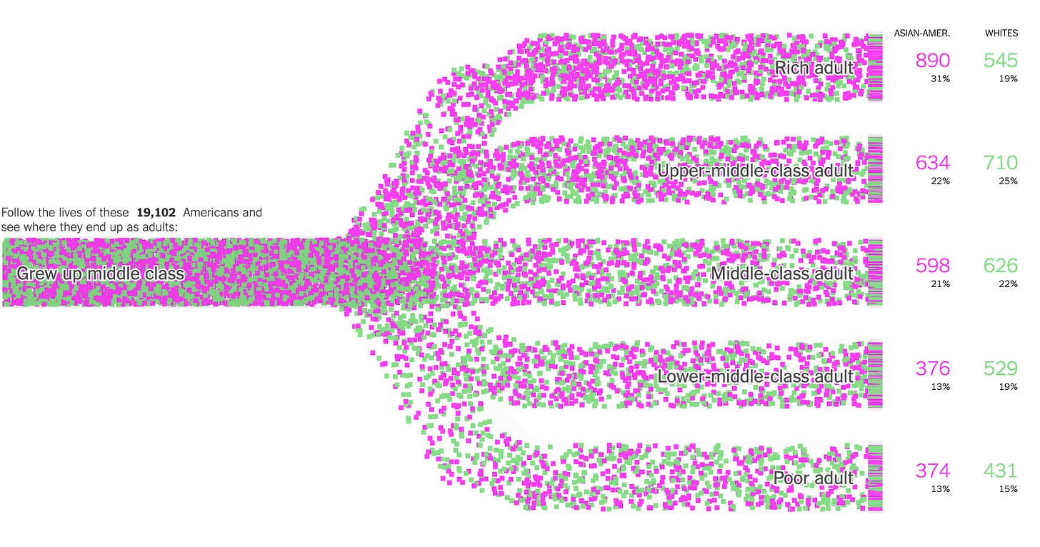
🔥Income Mobility Charts for Girls, Asian-Americans, and Other Groups
Here is an example of an income mobility chart built in D3 by Adam Pearce, an amazing data visualization expert.
While incredibly powerful, D3 is notoriously difficult to learn. Fortunately, I found an amazing resource in Amelia Watterberger’s D3 Data Visualization Book.
Here is an example of a similar education mobility chart that I built after completing chapter eleven of Fullstack D3 and Data visualization.
🔥 Simulated High School Education Mobility Chart deployed on Github
Alternative to D3, there are hundreds of other data visualization tools. Many newsrooms, without the need for customizing their charts, are adopting Datawrapper
Like this example in the Daily Princetonian, Datawrapper provides clean and elegant graphs, without any coding required!
💰Princeton Businesses Received over $200M in PPP Loans. Some are Still Struggling.
If you are interested in learning any of these tools, please let me know. I’d love to talk more about them and learn together!
Thanks for reading!


