How to Tell Stories with Sentiment Analysis
My attempt at introducing math to the newsroom while analyzing QAnon
Hello! Edward again,
I recently published a report on Bellingcat titled “The QAnon Timeline: Four Years, 5,000 Drops and Countless Failed Prophecies.” This was the result of a four-month-long investigation, and I’m especially grateful to the editors at Bellingcat, and Bill Thompson, who’s been an amazing mentor and research advisor for the piece.
🍕 The Qanon Timeline: Four Years, 5,000 Drops and Countless Failed Prophecies
There’s been overwhelmingly positive feedback (many from Brackets readers, so thank you all!) By far the most popular question and point of interest has been on the methodology — where we used sentiment analysis to derive both quantitative and qualitative insights into the story of Qanon’s growth.
In this issue of Bracket, I’m going to reveal my methodology. I’ll also explain in depth how to apply this innovative new approach in storytelling, that will hopefully be a valuable asset for anyone interested in distilling meaningful stories from data.
Getting started with the data …
The QAnon investigation was centered on a dataset containing 4,952 so-called “Q drops,” the cryptic messages that are at the heart of the conspiracy theory. These were posted by an anonymous person known simply as “Q” — whom followers believe to be a source of insider knowledge about US politics. Whenever a Q drop appears, believers around the world eagerly try to interpret its hidden meaning, connecting them to real world events.
The Q drop dataset was found on the image board 8kun, which was used by Q followers as a location to comment on Q drops. It contains posts dating back to October 2017, a time when QAnon theories were a fringe online hobby, and continues until October 2020 — by which time they were taken all too seriously.
Methodology
This goal of the investigation was to illustrate key developments and discussions in the QAnon conspiracy theory over time. To do this, we split the data into multiple subsets, each with one to three month long intervals.
For each subset, we ran a clustering algorithm that grouped sentences with a similar sentiment together. Using the results of the clustering, we then summarized major topics and notable developments for each time period.
“Sentiment” was evaluated using the Universal Sentence Encoder, an academically recognized text classification model that converted each Q drop into an array of numbers — a vector — based on its meaning.
Q drops with similar meanings have similar vectors. The closeness of two vectors can be calculated by taking their dot product. Thus we were able to evaluate the “closeness” in sentiment between sentences in order to categorize the text of each Q drop.
In summary, here are the three major steps. We’ll go over each of them individually, while the section above can be referenced as a high level overview of how the steps fits together.
Splitting Data into Sections
Sentiment Analysis
Algorithmic Clustering
1) Splitting the Data 🐼🐍
First, we want to split the data, over smaller time intervals, into multiple subsets, and perform any needed cleaning of the data. This is just data analysis 101, so I’m not going to go into too much detail, but will recommend some additional resources in case you’re interested in reading more!
My favorite data analysis tools are the dynamic duo of Python + Pandas. You’re welcome to use any programming language here, but if you’re taking a first dive into data analysis, would strongly recommend this technology stack!
🐍 Python is a programming language. PyCharm is my preferred developing environment for running Python, but many data scientists also prefer using Jupyter Notebook.
🐼 Pandas is a widely popular and super powerful data analysis library for Python.

If you’re interested in an intro to Pandas tutorial that goes over importing a dataset and cleaning the data, here’s a good resource from Towards Data Science. Otherwise, another reason why I recommend Pandas for any data analysis task is because of its incredibly powerful “Groupby” feature.
The Pandas Groupby function allows us to take a dataframe (a dataset in Pandas) and easily split it into subsets based on a shared attribute.
In this use case, we can “groupby” months to divide the dataset over time intervals. The specific code snippet for grouping by months is available on this stack overflow article and an amazing guide for iterating through “grouped” data in Pandas is available here.
2) Sentiment Analysis
Words are hard to work with — we’d much prefer numbers! (said no other journalist ever, but very true for the purposes of sentiment analysis.)
The ideal goal is to convert every Q drop into an array of numbers that represent its meaning, so that our dataset of drops looks more like this:
So … how do we do this?
The answer is word embeddings, a learned representation of text where words with similar meanings have similar representation. As word embeddings are a technique in natural language processing, and a subset of machine learning, there’s basically two ways to do this:
a) train our own word embedding model from Qanon related data.
b) borrow someone else’s word embedding model to convert text into numbers.
As the former requires many many months of work, we are going to go with the latter. In this example, I went with an academically acclaimed word embeddings model published by Google, that was trained with a variety of data including political texts, and optimized for sentences and short paragraphs. A tutorial for this model, the “Universal Sentence Encoder,” is available here.
🦜 Guide to using the Universal Sentence Encoder
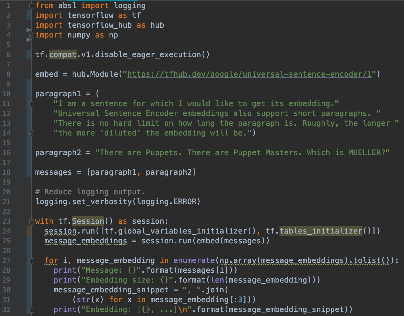
We import TensorFlow, a popular Python machine learning library developed by Google.
The ensuing section of code is from the Universal Sentence Encoder guide, where on line 8 we download the “embed” module from the internet, which takes our input text and converts the text into a vector, a list of 512 numbers. The output data is contained in the “message_embeddings” variable which we can use to analyze and export the data into an excel sheet.
3) Clustering Things Together
Before we cluster similar drops together, we need to know how to evaluate that two drops are similar. Fortunately, we’ve already converted the Q drops into vectors (basically arrays of numbers). I remember from Mr. Wilson’s high school math class that the “similarity” of two vectors is proportional to their dot product, with parallel vectors having a dot product equal to 1.
Finding the dot product of two vectors is super easy in Python:
import numpy as np
print(np.dot(a, b))
Turning up the Heat [Map]
Let’s see an example of all of this in action! Below we have 10 sentences from Q drops. Five of them are related to Robert Mueller and five of them are related to Facebook.
List of 10 sentences:
Mueller1: "There are Puppets. There are Puppet Masters. Which is [MUELLER]?",
Mueller2: "Attempt to replace [JC] as FBI Dir FAILED [attempt to regain FBI control].",
Mueller3: "[MUELLER] [Epstein bury & cover-up].",
Mueller4: "[MUELLER] [plot to remove duly elected POTUS].",
Mueller5: "BIGGEST SCANDAL IN AMERICAN HISTORY. TREASON.",
Facebook1: "What is FB?",
Facebook2: "Spying tool?",
Facebook3: "Who created it?",
Facebook4: "Who really created it?",
Facebook5: "Nothing is what it seems."
Using a heat-map, made with the Seaborn library in Python, we can visualize the dot product of each pair of sentences on a scale from 0 to 1. The diagonal is all dark red because each drop is identical to itself. Notice how the upper left corner is mostly orange, as the Mueller sentences are more correlated with each other, while the Facebook sentences are scarcely related except FB3 (“Who created it”) and FB4 (“Who really created it”), highly similar and colored in red.
For the final step, we can run a clustering algorithm on the Qanon drops to classify similar drops together. In this example, we used Agglomerate Clustering, although there are numerous other clustering algorithms out there.
Here’s a tutorial for applying agglomerate clustering in Python. It’s able to group vectors / lists of numbers based on their similarity, while taking into account the math from our quick lesson on vectors.
We simplify specify the number of clusters we want, and run the algorithm on a subset of Q drops. I generally modify the number of clusters based on the number drops in the subset. This is one limitation of this algorithm, where another clustering algorithm like KD means might be able to better predict the best number of clusters for a dataset.
Lastly after performing the algorithm on the dataset, we can read through the drops in each cluster for the most common trends — and then write about them — the qualitative / journalistic part of the investigation that computers could never automate.
If you’re interested in reading the final product, the outcome of this methodology in investigating Q drops, here’s the link:
🍕 The Qanon Timeline: Four Years, 5,000 Drops and Countless Failed Prophecies
Let me know what you think, would love to hear any comments or feedback.
A version of this post was also published on Towards Data Science this week.


